Creating an effective landing page is essential for capturing leads, driving sales, and improving overall marketing performance. A well-designed landing page can significantly boost conversion rates and enhance user experience. This guide showcases some of the best landing page examples and provides insights into what makes them successful, helping you apply these principles to your own web design projects.
What is a Landing Page?
A landing page is a standalone web page created specifically for a marketing or advertising campaign. It’s where a visitor lands after clicking on a link in an email, ad, or other digital location. The primary goal of a landing page is to convert visitors into leads or customers by encouraging them to take a specific action, such as filling out a form, signing up for a newsletter, or making a purchase.
Key Elements of a High-Converting Landing Page
To create a high-converting landing page, it’s essential to focus on several key elements:
- Compelling Headline: A clear and engaging headline that grabs attention.
- Strong Call-to-Action (CTA): A prominent and persuasive CTA that encourages visitors to take the desired action.
- Visual Appeal: High-quality images and videos that enhance the user experience.
- Concise and Persuasive Copy: Clear, concise, and persuasive content that highlights the benefits and value proposition.
- Trust Signals: Testimonials, reviews, and endorsements that build credibility and trust.
Top Landing Page Examples
1. Airbnb
Airbnb‘s landing page is a prime example of simplicity and effectiveness. The page features a clean design with a clear headline, a strong CTA, and high-quality images that showcase the unique experiences offered. The use of trust signals, such as user reviews and ratings, further enhances credibility and encourages visitors to book their stay.
Key Takeaways:
- Use high-quality visuals to engage visitors.
- Highlight unique selling points with clear and concise copy.
- Incorporate trust signals to build credibility.
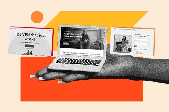
2. Dropbox
Dropbox uses a minimalist design approach for its landing page. The page features a straightforward headline, a compelling subheadline, and a strong CTA. The use of white space and simple visuals keeps the focus on the main message and encourages visitors to sign up for the service.
Key Takeaways:
- Keep the design clean and simple to avoid distractions.
- Use white space effectively to draw attention to key elements.
- Provide a clear and compelling CTA.
3. Unbounce
Unbounce‘s landing page is designed to showcase the benefits of their landing page builder. The page features a clear headline, a strong CTA, and a detailed explanation of the product’s features and benefits. The use of customer testimonials and case studies provides social proof and builds trust.
Key Takeaways:
- Highlight the benefits and features of your product or service.
- Use customer testimonials and case studies to build credibility.
- Provide detailed information to educate visitors.
4. Shopify
Shopify‘s landing page is designed to attract entrepreneurs looking to start an online store. The page features a clear and engaging headline, a strong CTA, and a detailed explanation of the platform’s features. The use of high-quality visuals and success stories from existing users adds credibility and encourages visitors to sign up.
Key Takeaways:
- Use engaging headlines to capture attention.
- Highlight success stories and case studies to build trust.
- Provide detailed information about your product or service.
5. HubSpot
HubSpot‘s landing page for their free CRM tool is a great example of how to effectively promote a product. The page features a clear headline, a compelling subheadline, and a strong CTA. The use of bullet points to highlight key features and benefits makes it easy for visitors to understand the value proposition quickly.
Key Takeaways:
- Use bullet points to highlight key features and benefits.
- Provide a clear and compelling CTA.
- Use subheadlines to provide additional context.
Best Practices for Designing Effective Landing Pages
- Keep It Simple: Avoid clutter and focus on the essential elements that drive conversions.
- Focus on the User: Design with the user in mind, providing a seamless and intuitive experience.
- Use High-Quality Visuals: Incorporate high-quality images and videos to enhance the user experience.
- Highlight Benefits: Clearly communicate the benefits and value proposition of your product or service.
- Optimize for Mobile: Ensure your landing page is mobile-friendly to reach a broader audience.
- Test and Iterate: Continuously test different elements of your landing page to optimize performance.